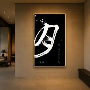
When I Commission Myself—
Contemporary Calligraphy by Fuh-mi
These are the works I create when no one is asking.
Not commissioned, not requested—just born from intuition, curiosity, or the desire to express something before I even understand it myself.
When I commission myself, the question is not “What does someone else need?”It is “What do I need to say, feel, or explore—right now?”
Some of these pieces come from silence. Others, from frustration, delight, dreams, or memory.I allow the words to arrive, the brush to move, and the form to take shape on its own terms.
These works are not about permanence. They are about presence.They reflect the rhythms of my life as an artist—unfiltered, imperfect, honest.
What emerges in this space often becomes the seed of future commissioned works.And sometimes, these are the works that speak loudest—not because they try to say something, but because they simply are.

Contemporary artwork called "和 - Harmony" by Fuh-mi
Verticality as Language and Form
In a world where horizontal writing has become the global norm, the act of writing vertically feels quietly radical.
Verticality is not just a format—
it is a rhythm, a breath, a descent into meaning.
Like a weight sinking into still water, vertical writing draws the gaze downward, gently.
This descent isn’t just visual—it invites the breath to slow, the mind to settle.
In a world of horizontal acceleration, verticality creates a different kind of space: one that pulls us inward.
It doesn’t push for attention. It restores it.
In that moment, the written word becomes not just something to read—but something to return to.
In Japanese calligraphy, vertical writing has long been the standard, inherited from Chinese traditions. But even in East Asia, horizontal writing now dominates the digital and commercial landscape.
Kana—Japan’s native syllabary—holds a unique place within this tradition.
Unlike the structured boldness of kanji, kana writing allows for fluidity and spontaneity.
Through techniques like chirashi-gaki (scattered placement) and renmen (continuous flow), calligraphers compose not just with words, but with space.
Composition becomes choreography—each stroke a decision, each pause a breath.
Even within the formality of Japanese culture, kana invites a rare kind of freedom.
And in the West, vertical writing—especially of Roman alphabets—is seen as decorative, almost unreadable.
But I’ve explored it deliberately.
I arrange English or French words letter by letter, flowing top to bottom like a poetic column.
Interestingly, Japanese viewers can often read them with ease—despite the foreign language—while Western viewers may find them unfamiliar or disorienting.
That cultural contrast fascinates me.
What seems perfectly natural to me as a calligrapher becomes, in another context, a subtle act of disruption.
A quiet provocation.
And that is exactly where my work lives.
I write vertically not for effect, but because I believe vertical space offers something horizontal space cannot:
silence, structure, gravity.
In katakana digital rain, each stroke descends like a signal from another realm.
In continuous kana, verticality becomes breath—unfolding with fluid grace.
In vertical Roman letters, the familiar becomes unfamiliar, forcing the viewer to slow down, to notice.
Even in seals (rakkans), stamped one below another, vertical rhythm becomes a kind of pulse.
Where modern calligraphy often seeks dynamism through splatter, speed, or scale,
I seek it in stillness.
In repetition.
In the gravity of the vertical line.
Verticality is my axis.
It is where language becomes form,
and where form returns to contemplation.

Contemporary artwork called "Between 0 and 1" by Fuh-mi

Musubi Neko — Mischief in a Knot
Every artist needs a little troublemaker.For me, that’s Musubi Neko.
Inspired by the traditional Japanese family crest musubi karigane (結び雁金), this cheeky cat was born from a playful twist of visual history and feline attitude.Its name comes from musubi—the tying of a knot—and neko, of course, the cat that rules the world.
These aren’t traditional calligraphy works; they’re pop-style drawings with a graphic sensibility and a sense of humor.Musubi Neko surfs, spies, stretches, and occasionally gets tangled in its own tail.Each design riffs off the same core shape—part knot, part cat, all charm.
Yes, I make meditative scrolls and conceptual calligraphy.But I also believe in art that smiles back at you.In a world that can be too serious, Musubi Neko reminds us that curiosity is its own kind of wisdom—and cuteness, its own form of power.
It started as a lighthearted experiment.
Now it’s become a growing series.
And honestly?
Neko rules the world.

Contemporary artwork called "Cowabunga!" by Fuh-mi
Brushed Truth – A Portrait Series
This piece is part of my short-lived but meaningful Pure Portrait Project, an experiment in fusing photography and calligraphy to reveal a person’s essence.
The idea stemmed from something I’ve long felt about Japanese culture—how often our public faces and private truths are out of sync. In my years as a corporate employee, I experienced this dissonance firsthand: the pressure to perform, to conform, to suppress. I wanted to create a space where something more authentic could surface.
So I began photographing people while in conversation—allowing the camera to capture not just their appearance, but the atmosphere between us. Then, using brush and ink, I wrote the word I felt captured the truth behind their expression.
This woman was someone I met in Taipei. In person, she was quiet, graceful, humble and kind. But when she faced the lens, I saw something else: a clear, unwavering gaze that held an inner blaze—cool, contained, yet unmistakably fierce.
The character I wrote across the print is 焔 (homura) — flame.
Because sometimes, strength burns brightest in silence.

Contemporary artwork called "Flame - 焔" by Fuh-mi


